50 Decomposition: four functions, one chart
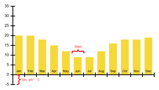
Twelve numbers, one for each month, hold the average temperature of a city. The starter code brings two such rows of real climate data, one for Linz and one for Johannesburg, and your job is to turn them into a chart that anybody can read at a glance. That is more work than a domino, and it is the point where a new habit starts to pay. Before you write a single line, you split the picture into jobs, give every job a name, and only then start coding.
50.1 AI tutor
Charts fail quietly. The bars grow downward, the labels are shifted by one month, or everything is squeezed into the top left corner, and the program never complains. When your picture disagrees with the one above, tell the tutor which formula you used for the position and what you see on the canvas.
Hints and questions instead of finished programs, in English or German.
50.2 Two roads to the same functions
There are two ways to end up with a program made of functions. Refactoring starts from code that already runs, and you pull the repeated pieces out into functions afterwards, like the dice that became drawDice (Section 48.7). Decomposition works the other way around. You start from the problem, split it into jobs, name the jobs, and write the code job by job. The split happens on paper, before the first line of code.
Splitting a picture into simpler parts is not new to you. Your first own program did it with a house made of rectangles and a triangle (Section 3.2). What is new is that each part now gets a name and a body of its own, so the split survives in the code instead of only in your head.
The temperature chart splits into four jobs, and the starter code already carries their names:
function drawAxes(): void {
  // <<< Add code to draw X and Y axes here
}

function drawYLabels(): void {
  // <<< Add code to draw labels for the Y axis here
}

function drawXLabels(): void {
  // <<< Add code to draw labels for the X axis here
}

function drawTemperatures(temperatures: number[]): void {
  // <<< Add code to draw the temperatures here
}
Three of them need nothing from the outside and always paint the same thing, so they have no parameters. The fourth one is different. drawTemperatures takes an array of numbers, which means the same function draws the bars for any city you hand it.
50.3 The array travels as a reference
A parameter is a variable, and handing an argument over to a function fills that variable exactly the way an assignment fills one. So everything the arrays part said about assignments applies to function calls too (Section 45.4).
For numbers and booleans, the parameter gets a copy of the value. The function may do whatever it likes with that copy, and the caller never notices. The happy parameter of the smile function (Section 47.5) was such a copy. This kind of handover is called call by value.
drawTemperatures(AVG_TEMP_JOHANNESBURG) behaves differently. It hands over the arrow, not twelve copied numbers, so the parameter temperatures points at the very same array as the constant. That is efficient, and it has a consequence. If the function wrote temperatures[0] = 0;, Johannesburg’s real data would be changed for the rest of the program. This kind of handover is called call by reference.
drawTemperatures only reads its array, so nothing goes wrong here. From now on, though, remember that a function which receives an array holds the caller’s data and not a private copy. A function that really has to change things builds a real copy first, with the empty array and the loop from the arrays part (Section 45.6), and works on that one.
50.4 Plan it on paper
Take your sheet of paper and write the plan down before you open the playground.
- Write the four function names below each other.
- Next to each name, write one sentence about what it paints. Be concrete, “the two black lines the chart hangs on” is a plan, “the axes” is just the name again.
- Sketch the chart roughly and mark two things in it: where the line for 0 degrees runs, and how wide one month is.
- Under the sketch, write the four names again, this time in the order in which they must be called.
Step 4 is the easiest one to skip, and it is the one that decides whether your chart looks right.
50.5 Draw order decides what you see
Look at the finished chart at the top of this chapter. The month names sit on the yellow bars, and the zero line runs across their feet. Every shape is painted on top of what is already there (Section 3.4), so this picture only comes out if the bars go down first and the axes and labels follow:
drawTemperatures(AVG_TEMP_JOHANNESBURG);
drawAxes();
drawYLabels();
drawXLabels();
Turn those four calls around and the chart is still there, but the bars cover the zero line and swallow the month names. The picture is the test, and the order of the calls is part of your program’s design.
50.6 From degrees to pixels
A chart is a translation. The data is in degrees Celsius and in month numbers, the canvas wants pixels, and two formulas do the translating:
let x: number = 50 + i * 30;
let y: number = 225 - temperatures[i] * 5;
The x formula starts at 50, which is where the vertical axis stands, and moves 30 pixels to the right for each month. Month 0 starts at 50, month 1 at 80, and so on until month 11 at 380. Each bar is 20 pixels wide and gets five pixels of air on both sides, so it is drawn five pixels right of the column start.
The y formula is the more interesting one. 225 is the height of the zero line on the canvas, and every degree is worth five pixels. The minus sign is there because y grows downward, so warm months must land above the zero line. 20 degrees becomes 225 - 100, which is 125, and the bar is 100 pixels tall.
January in Linz is -0.7 degrees. Put that into the formula on paper. The top edge lands at 225 - (-0.7 * 5), which is 228.5, below the zero line, and the height -0.7 * 5 comes out negative. A rectangle with a negative height is drawn upward, so the bar hangs below the line, exactly where a reader expects a freezing month. One formula, both directions, no if needed.
50.7 Ticks and labels come from loops
The exercise has one hard rule. Every tick mark and every label is placed by a loop, never by a hand-written position. Twelve hand-typed x values would work today and break the moment you change the width of a column.
For the temperature scale, the loop counts in degrees, not in pixels:
for (let t: number = -5; t <= 35; t += 5) {
  let y: number = 225 - t * 5;
  // a short line across the axis, and the number t next to it
}
The loop variable t is a temperature, and the same formula as for the bars turns it into a y position. Check the two ends: -5 becomes 250 and 35 becomes 50, and those are exactly the two ends of the vertical axis line. The scale and the axis fit because they are computed from the same numbers.
The month loop works the same way, with x computed from the loop variable. Its labels use the text box form of text with five parameters (Section 17.4), one box per column, so each month name is centered under its own bar.
50.8 The month names come from a switch
The loop counts 1, 2, 3, and the chart needs “Jan”, “Feb”, “Mar”. Mapping a handful of fixed values to fixed results is what switch is for, the same tool you used for the domino symbols (Section 49.4):
let month: string = "";
switch (i) {
  case 1:
    month = "Jan";
    break;
  case 2:
    month = "Feb";
    break;
  // ... ten more cases ...
}
The variable is declared before the switch and filled inside it, so it still exists when the text call below needs it. Do not forget a single break, or your December will be called something else entirely.
50.9 Implement one, test one
Four empty functions are four chances to make a mistake, and if you write all four before you press Run, you will not know which one is wrong. The exercise asks for a different rhythm.
Write one function. Call it from setup. Run the program and look at the canvas. Only when that part is right do you start the next function. Your first run shows two bare lines, your second one adds the temperature scale, and the picture grows toward the goal with every step.
One detail catches everyone. The order in which you write the functions is not the order in which you call them. You implement drawTemperatures last, and its call still has to move to the first line of setup, because the bars belong under everything else.
50.10 Your exercise: Temperature Chart
- Paper first. Do the four planning steps from the section above. Keep the sheet next to the keyboard while you code.
- The axes. Write
drawAxes, call it fromsetup, run it. The vertical line carries the temperatures, the horizontal one is the zero line, not the bottom edge of the canvas. - The temperature scale. Write
drawYLabelswith the degree loop from -5 to 35. Tick marks and numbers come from the same loop. - The months. Write
drawXLabelswith a loop over the twelve months and theswitchfor the names. - The bars. Write
drawTemperatureswith the two formulas, then move its call to the top ofsetupso the bars sit under the axes and labels. - Experiment. Swap the argument to
AVG_TEMP_LINZ. The data is real, and the chart tells you something true. Linz is warm in July and freezing in January, while Johannesburg does the opposite, because it lies south of the equator where the seasons are turned around. Then find the one Linz month that dips below the zero line and compare it with the calculation you did on paper.
50.11 Check your understanding
When both cities draw correctly and you can say out loud why the bars are painted before the axes, take the short quiz below. You answer six questions about this chapter in your own words, and an AI reads your answers and tells you what you already understand and what you should read again. The quiz is anonymous, and answering in German is fine too.